 Save as PDF
How to Use the Class Comparison Report
This report gives educators the ability to compare class results on common assessments — whether the comparison is of different teachers or one teacher who is teaching multiple sections of the same course. The report comes in three versions, one that splices data by question, one that does so by standard and another that uses scaffolded or rewritten skills/standards (if that work was done).
The intent of this report is to facilitate positive discussions between teachers about what is working/not working in their classrooms.
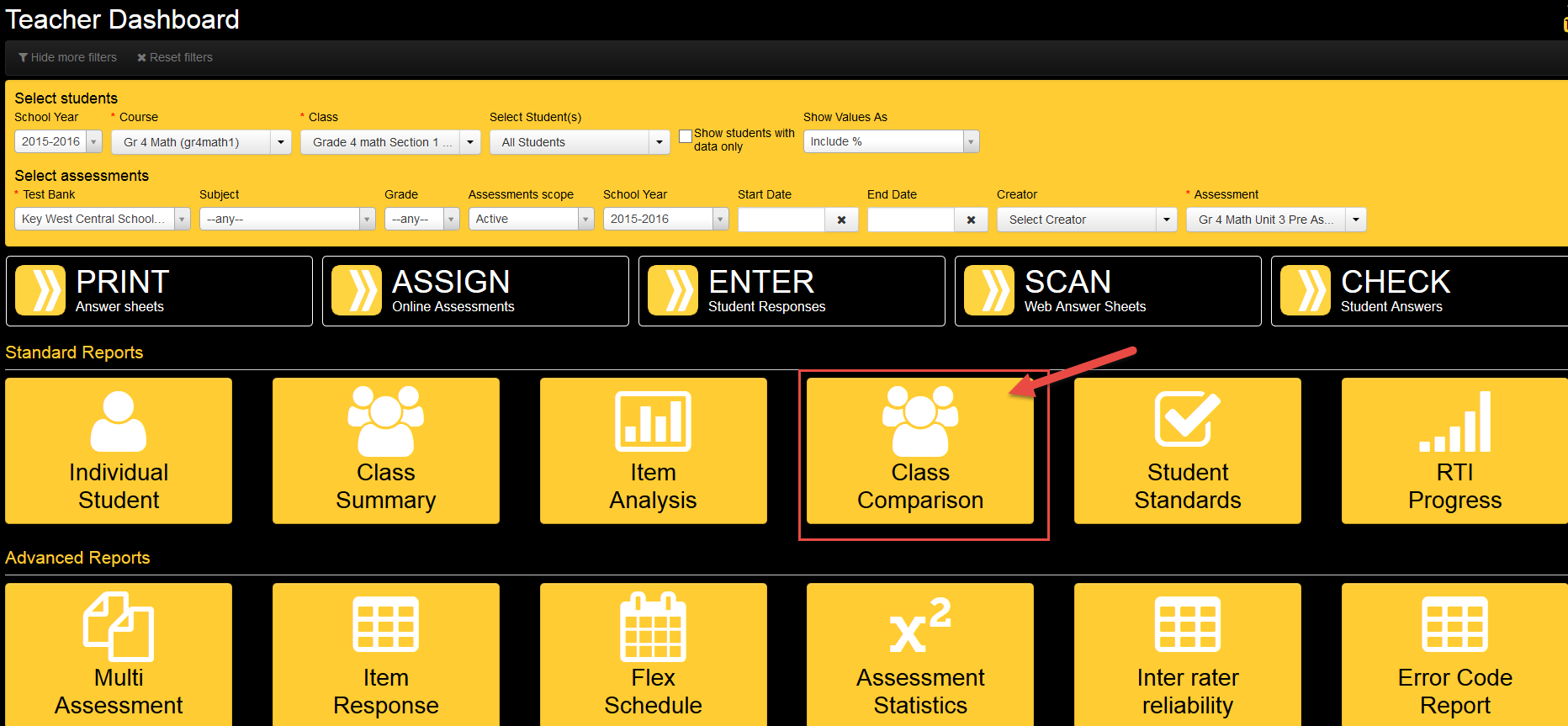
After selecting this report from the “Teacher Dashboard" (shown above), a pop-up prompts users to select a color scheme. A number of pre-loaded schemes can be selected. If a district-specific scheme is desired (perhaps unique benchmarks are being targeted), an eDoctrina representative should be contacted. The scheme used in the sample above is based on tracking two such data points -- red for scores of 0-60, yellow for scores 61-75.
The Class Comparison Combined Report (located as the last page of the report) is the most popular report format. This report compares how each class performed on learning standards and questions on the assessment. The report will even include how students performed on questions based on the difficulty levels the questions were tagged with.
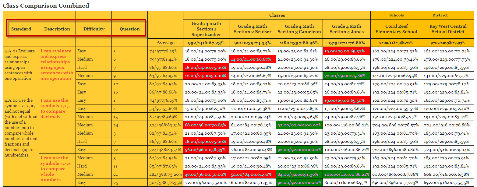
The last two columns in each of the report formats compare how the classes selected performed in comparison to School and District performance.
Note that question difficulty levels will only appear if the user has tagged the question with this information.